Branding seems to be the new buzzword at the University City District (www.ucityphila.org), which rolled out a new marketing plan and a shiny new logo over the summer months.
Since the special services district began life in 1997 it has sported a distinctive circular emblem with a ring of sunshine yellow surrounding a green core. A blue squiggle in the middle was intended, says UCD marketing director Lori Klein Brennan, to represent a tree. “But it wasn’t identifiable, that was one of the problems. It also looked like a cloud.” Another problem with the logo, according to Brennan, was its “municipal look,” which suggested a direct connection with city government that didn’t exist.
To establish a separate identity, UCD looked to consulting firm Kanter International, which also worked with them on a broader strategic marketing plan. The new logo is sleek and streamlined, a sly play on the letters U, C and D. “We were looking for a logo that was contemporary, that was unique, and something that would make the viewer have to stop and think about its meaning. We think it speaks to the intellectual side of University City as well as its artful side.”
As with the old logo, though, different people see different things. The feedback so far? “Some look at the graphic and see the Schuylkill River. Others see cobblestones. Some see a bridge. And of course they see the letters,” says Brennan.
Along with the new logo comes a new marketing tagline: “Left of Center.” Kanter came up with that, too, though initially the slogan, which will appear on mugs, T-shirts and marketing materials, was “Left of Center City.” Says Brennan, “It took us 10 seconds to decide that we liked it but didn’t want to include ‘City.’ We wanted a tagline that could mean multiple things. ‘Left of Center City’ would have conveyed just one idea. ‘Left of Center’ can convey many things. Different. Diverse. Funky. We wanted to leave it open ended.”
In this election year, of course, using the word “left” carries its own freight. “That was not our intention,” counters Brennan. “In no way is it meant to be that way. We wouldn’t be able to speak as a political voice like that for University City.”
Penn engineers and collaborators have developed a transparent, micro-engineered device that houses a living, vascularized model of human lung cancer—a “tumor on a chip”—and show that the diabetes drug vildagliptin helps more CAR T cells break through the tumor’s defenses and attack it effectively.
Tumor-on-a-chip offers insight into cancer-fighting cells in immunotherapy
Penn engineers and collaborators have built a living tumor on a chip to expose how cancers block immune attacks, and how one existing drug could make immunotherapy like CAR T more effective against solid tumors.
Professor of city and regional planning Erick Guerra recently published a book exploring the economic and societal impacts of American highways. He explains some of the pitfalls associated with an ever-expansive highway system, arguing that spending more on highways might not be the solution to the country’s transportation issues.
Penn urban planner Erick Guerra’s new book, “Overbuilt,” argues that additional spending on building more highways might not be the solution to the country’s transportation issues. In a Q&A, Guerra shares his insights.
Xin Sun prepares samples collected from the Eastern Tropical North Pacific aboard a research vessel. By adding stable isotope tracers to these vials, Sun and her team can track how different microbial groups convert nitrogen compounds into nitrous oxide, revealing how subtle shifts in oxygen and organic matter change the ocean’s chemistry.
Can tiny ocean organisms offer the key to better climate modeling?
In the shadowy layers of the Pacific, microbes decide how much nitrous oxide—a potent greenhouse gas—rises skyward. New research from Penn’s Xin Sun offers an improved understanding of microbial ecology and geochemistry—key to forecasting global emissions in response to natural and man-made climate change.
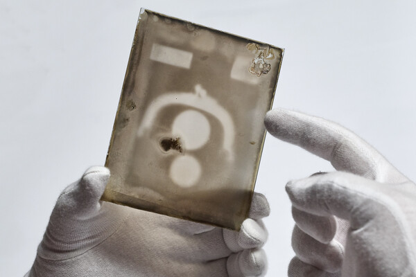
Two X-ray plates from Arthur Goodspeed, believed to have created the world’s first X-ray image, were donated by his family to Penn’s University Archives.